In the early days of the Internet, users found themselves frustrated with websites because the user interface (UI) didn’t provide the information they needed or didn’t make options clear.
In simpler words, the UI sucked.
Take a look at these screenshots (see links) from these popular sites to check out how they look just a couple years ago:
- Google (used to be Google!) in November 1998
- Yahoo! in January 1999
- Mashable in July 2005
If you compare them to how they look nowadays you will see that a whole lot has changed. All of the improvements that Google, Yahoo!, Mashable and other sites have implemented can be summarized in three words: Better User Interface.
Good UI design allows users to achieve goals quicker and make the overall site experience much more enjoyable. This is why in this article we are going to review 3 examples of good UI design.
1. Endless Scroll Pagination
The 3 screenshots above are good examples of paginations that limit the browser from displaying all of the content at once. Pagination allows data to be compiled into pages so that the content doesn’t overwhelm the user. Under limited pagination, the user has to use “back” and “next” buttons to navigate the next page of content.
On the other hand, in an endless scroll pagination users can view an endless pool of content that automatically loads into the page as the user scrolls through the site. Pinterest and Twitter are successful examples of endless scroll pagination in social media. Twitter’s feed of live or archived tweets will provide you an infinite scroll of tweets that keeps you glued to your Smartphone or laptop for several minutes. Back in 2011, the average Twitter session lasted 13.1 minutes.
Among the pros of endless scroll pagination, three stand out. First, infinite scrolling enables faster browsing because of a coding tool called progressive enhancement that allows everyone access to basic content and functionality of a site, while providing an enhanced version of the site only to those that require through the use of certain devices. Second, infinite scrolling makes the user experience on mobile devices much richer because it encourages interaction with the screen. Third, it encourages people to go deeper into the site’s content. For example, studies show that 94% of Google users are just satisfied with the first 10 results. Endless scroll pagination extends the useful life of older content.
2. Metro Design Language
 While it is true, that an image speaks louder than a 1,000 words. The Metro design language, also known as the Microsoft design language, challenged this notion by relying more on the typography and less on graphics from applications. Even though the Metro principles go as back as Microsoft Encarta 95 and the MSN 2.0 site, it is best known for its application in the release of the Windows Phone 7, Xbox 360, and Windows 8.
As you saw from the Yahoo! screenshot from 1999, every time that text was used, it needed to have a bullet point. The Metro Design language does away with bullet point and icons altogether by putting typography front and center. Metro uses typography in different sizes and weights to provide structure to information.
Metro design language is one of the reasons that the Windows Phone is gaining in adoption across the world. As of September 2013, Forbes indicates that in five main European territories (Germany, UK, Italy, Franc and Spain), the Windows Phone gained a market share of 8.3%. In France, the market share almost tripled.
The main benefit of using the Metro design language is that it puts less pressure on computing power, which is particularly important on mobile devices. By giving processors a breather, battery life is extended.
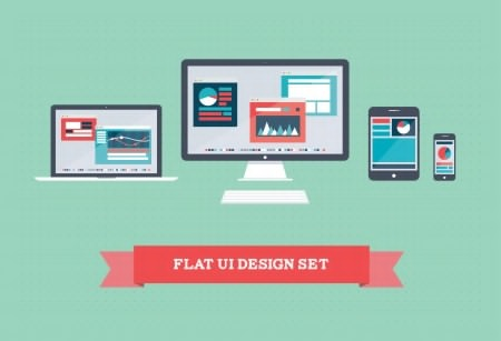
3. Flat UI Design
One UI design trend that is booming in 2012 is flat UI design. This design trend is an evolution of the Metro design language. Flat UI design does away transfers emphasis from style to functionality. This means getting rid of beveled edges, gradients, shadows and reflections. It means moving from the iPhone layout to the Windows Phone layout.
Google has adopted the flat UI design in its apps across Android devices, particularly the Google Now app. Facebook has been using flat design to redesign all of its icons including the ones for the Developers, Privacy, US Government and Facebook Live sections.
Here are some great examples of flat UI design:
- The 2012 Year on Twitter Report
- Wrist Illustrative Exercise
Flat UI design is also beneficial for the battery life of mobile devices. Instead of forcing the phone to work overtime to display a sparking, shiny, and gyrating CD; flat design favors the use of a flat icon of a musical note, which not only does a better a job, but also saves computing resources.
If you have any questions about these or other UI design examples, feel free to contact us today. We will be happy to take your questions and let you know about our web design philosophy.
We look forward to learn about your business and find out if we can help you. Schedule a free consultation to talk about your web needs.

Comments