Let’s Talk About Mobile Web Design.
Developing a site for mobile and tablet devices is not the same as building one for a desktop PC or laptop. Not only are you limited to smaller screen but also you need to take a different web design approach.
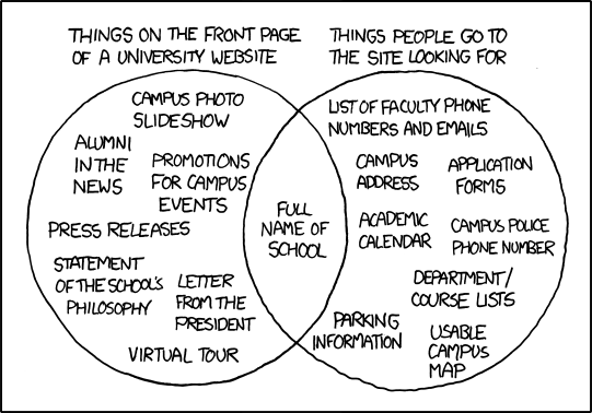
Let’s take a look at this cartoon about university websites from Randall Munroe’s xkcd series:
This cartoon was well received by university website designers around the country. “The cartoon is right on target,” wrote Martin Ringle, CIO of Reed College in an email to Inside Higher Ed, an online source for news in higher education. “College website design typically focuses on what an institution wants to say, not necessarily what prospective students (and others) want to know”, added Ringle.
This same point applies to mobile web design. You need to provide your mobile users with what they want to know.
On mobile devices you have 3 forces working against you:
- Studies show that in a best-case scenario, we only read 28% of the text on a web page. That percentage gets even smaller on smaller screens.
- If you try to tell your site visitors “wait a second while we load our site”. That is actually too long! Back in 2002, Harry Shun, a computer scientist and speed specialist at Microsoft, indicated that your site needs to load 250 milliseconds faster than a close competitor for users to stay.
- More and more devices are becoming available to consumers. Long gone are the days that you had to worry just about Blackberry, Apple and Android. There are hot mobile devices arriving to the market every month that are slowly chipping away the market share from the incumbents.
These 3 forces at play make the mobile platform a harsh one to work with.
Cheer up, this doesn’t mean you are forced to be boring. There are several designers that have been able to show some creativity in their designs.
So, let’s take a look at 3 specific examples for some mobile web design inspiration.
1. The Portfolio
Let’s imagine that you are a professional in the architecture field and you are interested in showcasing your work and making it easy for people to contact you. A great example of mobile web design for this category is the site from Andersson-Wise at http://www.anderssonwise.com.
This site is great because it adapts very well to both tablets and smartphones. The site’s header speaks loud and clear to visitors and sets a clear expectation of what they can do.
Andersson-Wise also gets extra gold stars for how they focus on crisp images to showcase their projects and optimizing the images for fast upload on mobile devices.
Finally, their Contact Information page is very clear and makes smart use of white space and typography to provide addresses, emails and phones. Also, notice how they have made it extra easy for visitors to follow Andersson-Wise on Facebook, send an email inquiry and subscribe to their email newsletter.
2. The Magazine

Let’s switch gears and move on now to a more familiar example: Time. Founded in 1923, Time has the world’s largest circulation for a weekly news magazine. Back in October 22, 2012, Time.com became the first global news site to roll out a fully responsive mobile design optimized for browsing in smaller screens.
Instead of tackling design device by device, Time.com decided to address them all at once. By using responsive design, all of the site’s pages automatically resize to the screen of the device you are using.
No matter whether you are using an iPhone, Kindle, Blackberry Bold, Samsung Galaxy, or any other Smartphone or tablet.
Notice the power of that statement: Time leaves no user behind.
Through this approach, Time is capable of putting more emphasis and promotion of their industry-leading photography. An image speaks louder than a 1,000 words and this applies to mobile web design as well.
3. The Online Shop
As you know I work out of Seattle and my dear city is home to one of the country’s largest population of hipsters. I couldn’t resist including one example that pays homage to this booming American subculture: Skinny Ties at http://skinnyties.com. The name of this site gives a fairly good indication of what it sells, and it has created a simple yet attractive storefront that scales perfectly for all screen sizes.
I selected the Skinny Ties site because online retailers need to realize that the U.S. mobile payment software market is on schedule to reach $90 billion in 2017, according to a 2013 report from Forrester.
That’s a lot of cash!
Just like Time is not leaving any user behind, Skinny Ties leaves no shopper behind.
The Bottom Line
As more and more people are using mobile and tablet devices to use the Internet, you need to make your site ready for them. Designing your site for the mobile web doesn’t mean you have to be boring. These 3 examples just showed you how you can infuse creativity even on those smaller screens.
Need help with your mobile site? Click or call Seattle SEO Consultant at (888) 574-6067 for your free, no obligation 30 minute consultation today. We’re glad to help! We look forward to learn about your business and find out if we can help you. Schedule a free consultation to talk about your web needs.

 © Copyright
Comments