Internet design and technology changes as often as a traffic signal. One of the most recent change has to do with something called responsive design. If you have no idea what this is or aren’t aware of it’s earthshaking importance, you need to read this article.
What Is Responsive Design?
Let’s get a working definition in place so we know what’s being discussed. Responsive web design is a way of making websites look nice and function well on any device or browser size. It is a fluid web layout, adapting instantly to various sizes and parameters.
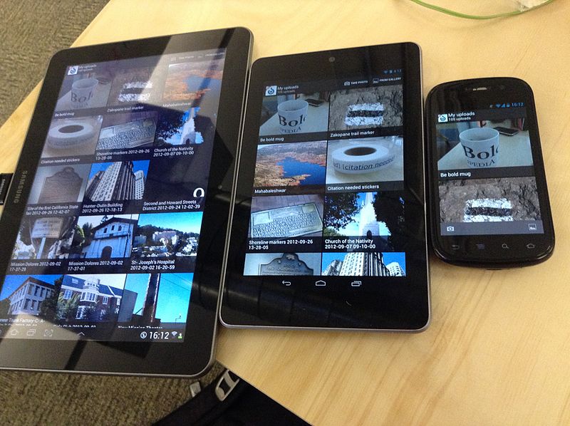
In other words, a site viewed in Firefox on your desktop looks fine whether your browser is sized to cover half the screen or the whole screen. The same website also looks and works effectively if you are browsing on your Android. It’s a simple concept, but it has profound implications for the web industry as a whole.
So what?
This is epic.
.net Magazine named it the number two of the Top Web Design Trends for 2012. John Polacek declared it to “represent a fundamental shift in how we’ll build websites for the decade to come.” Mashable has heralded 2013 to be “the year of responsive design.” QuickSprout states, “It’s a standard that’s taking everything you know about web design and turning it on its side”
So, it’s not just some cool CSS trick. It’s “everything,” it’s “fundamental,” and it’s changing the world of information and communication.
That’s why I called it “epic.”
Five Reasons Why It’s So Important
If RWD (the acronym geeks use) is just making websites look pretty and work nicely on any platform, why is responsive website design such a big deal? There are five main reasons.
1. Mobile is bigger than ever before.
The responsive design craze hinges totally upon mobile usage. The whole reason why responsive was born in 2010 was because of a tipping point reached by the market saturation with mobile devices, and the detrimental UX of non-optimized sites for Smartphone users. People want to use their Smartphones for browsing the Internet. The only way to make that experience successful is through responsive design.
Basically, mobile is huge; therefore, so is responsive design.
The remaining four points in this discussion build on this one, single, major point.
2. Apps have plateaued.
Remember the old adage, “there’s an app for that”? That was so 2010. Businesses who claim mobile market access share don’t always create apps. There’s a simple reason for this. Apps lack ROI. Apps don’t always feed the conversion funnel.
Instead, successful companies now create websites that employ responsive technology. Let’s face it. If I want to get a quick laugh from The Oatmeal, I’m not necessarily going to download an app. I just want to go to the site and see funnies. I need responsive.
Plus, it’s expensive to make apps, especially when you have to worry about developing for both Android and iOS. Companies are tired of apps, and so are consumers. Mobile friendly sites, however, are a growing need.
3. There are so many of every device.
Web sites aren’t going away. Notebook computers aren’t going away. Neither are tablets. And by no means are Smartphones going away. There are thousands of device variations. Heck, we might all be wearing Google specs in a few years.
With the excess of devices — and every conceivable screen size — there’s got to be a solution. It’s called responsive design.
4. Screen size affects conversion rates.
An often-overlooked aspect of RWD is its dramatic effect on conversion rates. Research from Prosper Mobile Insights reveals that the smaller the screen size, the more likely shoppers are to convert. An optimized mobile experience drives up conversions. That’s why smart mobile retailers are scrambling to get responsive design as fast as they possibly can. Potential customers on mobile devices are more likely to convert, especially if they have a pleasing mobile experience.
5. We all just want simplicity.
History is a series of pendulum swings (my philosophical blaze of insight for the year). We had the information age. Now, we’re still in the information age, but we’re tired of the Niagara of information crushing us like so many tweets, posts, texts, numbers, popups, notifications, and news articles.
What does this have to do with responsive design?
Responsive design is about design. Design trends have taken a pendulum trip to the side of Zen simplicity in an effort to palliate the nausea over excess information. RWD is totally in keeping with this. In order to accommodate Handhelds and tablets, responsive trims the excess. It retains the core. It is a simple design.
Even if we don’t know what “responsive design” means, we at least appreciate what it does.
That’s responsive design. And that’s why it’s such a big deal. Are you using responsive design in your web strategy?
Find out more about how we are helping clients big and small update their websites with responsive web design.
Schedule a free consultation to talk about your web needs. Be sure to keep up with us on Facebook and Twitter for the latest in search engine and design trends.

 © Copyright
  © Copyright
Comments