Web design is always evolving – where clicking to access additional content is largely the norm, site visitors increasingly prefer to scroll as smaller smart phone and tablet screens rapidly replace laptops and desktops for browsing. Color is one of the most critical components of your website design. Unfortunate color choices – think black background with yellow typeface – can make your site hard on the eyes, difficult to read and turn off your target demographic.
Color preferences in design evolve as well. Just as repainting a room in your home can give it a fresh look, so too can revamping your website colors to invigorate the feel and appeal of your site.
Here are five top web design color trends 2014
#1 Purple is the new black
The Pantone Color Institute – the arbiter of all things chromatic – unveils a color of the year annually based on detailed analysis of world and media events, technological advances and other global happenings. Last year it was Emerald and this year it’s another jewel tone in the hue of Radiant Orchid.
In its announcement, Pantone said the color “intrigues the eye and sparks the imagination” and “emanates great joy, love and health.” Admittedly this won’t be for everyone – not many plumbers or pizza places will likely be rushing to embrace purple as the new black – but depending on what your company does or sells, this may appeal.
#2 Keeping it simple
Have you ever seen a website that seems to run the gamut in font choices seeming to believe that variety is catchy? In fact, it’s a visual violation that’s more appalling than appealing and it’s the same with colors. For 2014 and the foreseeable future, simplicity in color schemes will be the trend. One or two key colors is all you need.
Simpler color schemes are easier on the eyes and make clickable icons stand out. Your site will be easier to read and navigate on the smaller screens of smart phones and tablets that most are now using. Short videos (like Vine and Keek’s multi-second displays), animated GIFs and eye-catching images are trending and simpler colors allow these to take the forefront.
#3 Flat is where it’s at
Rich color elements with shadows, bevels, gradients and textures have long been the rage, but the new trend is a 180 degree reversal to flat color schemes. Apple iOS7 was the death knell for skeumorphism (ornamental elements) in high tech design and color schemes and many web designers are following this trend and stripping sites clean.
Fewer and simpler colors and uber-functional design are trending. As with the mention of enhanced imagery and videos in #2 above, flat design allows you to play with other elements without overwhelming the eye. Look for custom created and experimental typography that goes beyond Times New Roman and Arial Bold and enhances your branding.
#4 Coloring outside the lines
While the trend is to simplify the color scheme of web pages themselves, there should be no dearth of other opportunities to infuse your site with color. Stock photos are falling out of favor and photorealism is gaining appeal with web surfers. Personal, genuine portraits of key employees and customers are preferable, whether in color or stylized black and white.
Landscapes manipulated with color elements are trending as are large hero images front and center in the banner area. Take a look at our home page for an example – we literally put the “hero” in our hero banner. Adaptive photography that scales to accommodate smaller screen size is important. And your images need clever, creative and informative captions to enrich viewer engagement.
#5 Color blast from the past
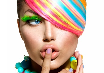
If you’re a fan of Flock of Seagulls and the Fresh Prince of Bel-Air, you may be excited to know some of the 80s are experiencing a revival. This includes the blinding colors of that era. Look for neons in web design. They’ve been on an upswing over the last couple of years and even if you fail to appreciate the iconic decade, you have to acknowledge the colors are eye-catching.
The years when Madonna wasn’t an embarrassing senior citizen brought us electric lime, orange and fuchsia. Today, these will be great for flat color icons and accents but would be a visual assault if allowed to take over the whole screen. Use these wild colors sparingly and you can achieve something creative and memorable.
If your website is static and gathering digital dust, contact Seattle SEO Consultant for a free consultation on how we can get you up to speed with adaptive design, enhanced SEO and an appealing color trend. Give me a call and let’s talk…
Chad
Comments