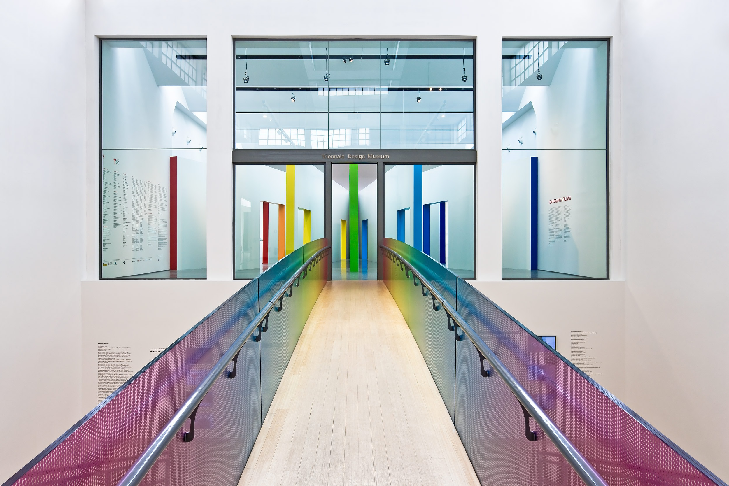
People love images. A website with nothing to look at is boring and won’t entice potential customers no matter how fantastic what you’re selling is or how well written your webpage copy. Your website viewer must be quickly engaged to keep them on your page and the best way to do this is with eye-catching visuals. Once you hook them with an image, well written copy is a must to keep their attention and close the deal. So how do you bait that all-important visual hook? Great graphic design.
“Design is the conscious effort to
impose a meaningful order.”
Victor Papanek
The Whole Is More than the Sum of the Parts
In addition to images, the colors used, borders, logo and everything that the reader looks at are elements of graphic design and must be considered together as parts of the whole. Even where you place the copy on the page, the size of the text area and the choice of font, text size and color are all pieces of your visual presentation that should work together to create a pleasing look.
“Design is not just what it looks like and feels like.
Design is how it works.”
Steve Jobs
Beyond simple visual appeal, the design must have a goal. Ultimately, you want a sale, a sign up or other action taken that encourages the reader to transact with you. Design should make it easy for the viewer to find the information they want, navigate the site easily and constantly move the reader toward consummating a sale or other transaction with you. Layout with a logical flow increases conversions.
False: If Some Is Good, More Must Be Better
When it comes to good design, this is absolutely not true. Piling graphics on top of videos on top of other multi-media doesn’t enhance your site, it clutters it. Strategically placing a few high quality visual elements will enhance the reader experience – rather than detract from it. Even if something looks really cool, if it’s not moving the viewer toward a transaction, it’s meaningless eye candy.
“When things aren’t adding up, start subtracting.”
Anonymous
It takes an artist’s eye to lay out a visually striking website. It takes web experience to ensure the design drives toward the end goal. It’s a marriage of business and creativity and not something most people can do on their own. Even if you hire a web savvy programmer, they may lack the imagination and eye to ensure your site is visually and purposefully engaging. You need a consulting firm that has both.
Visual Appeal Is Everything
A well designed website that’s visually appealing has a greater potential for profit than a poorly designed or overdone website. This can even affect your conversions for AdSense and banner ads if you use these advertising tools. These should be part of your design consideration. Optimizing ad placement in concert with your copy, images and other elements ensures they’ll be seen and encourages clicks.
“It’s a visual world and people respond to visuals.”
Joe Sacco
Design is a balancing act of art and science, visual and white space. You don’t want a chaotic design with too many images, flash video, sound and ads competing for your reader’s attention. This can ultimately turn off a potential customer. Cleaner design with lots of white space typically outperforms those with far too much going on. Too little is dull, too much is overwhelming.
If your conversions aren’t what you want, your traffic has tapered off or sales are suffering, your graphic design may be the problem. Let us show you a better way. We’ll look at your site, pinpoint the issues and tell you how we can help. Click to schedule a free, no-obligation graphic design consultation with Seattle SEO Consultant.

 © Copyright
Comments